The most commonly used deep networks are purely feed-forward nets. The input is passed to layers 1, 2, 3, then at some point to the final layer (which can be 10, 100 or even 1000 layers away from the input). Each of the layers contains neurons that are activated differently by different inputs. Whereas activation patterns in earlier layers might reflect the similarity of the inputs, activation patterns in later layers mirror the similarity of the outputs. For example, a picture of an orange and a picture of a yellowish desert are similar in the input space, but very different with respect to the output of the network. But I want to know what happens in-between. How does the transition look like? And how can this transition be quantified?
To answer this question, I’ve performed a very simple analysis by comparing the activation patterns of each layer for a large set of different inputs. To compare the activations, I simply used the correlation coefficient between activations for each pair of inputs.
As network, I used a deep network (GoogleNet) which is pretrained on the imagenet dataset to distinguish ca. 1000 different output categories. Here are the network’s top five outputs to some example input images from the imagenet dataset:

Each of these images produces a 1008-element activation vector (for 1008 different possible output categories). In total, I compared each pair of output vectors produced by a pair of input images for 500 images, resulting in a 500×500 correlation matrix. (The computational most costly part is not to run the network in order to get the activations, but to compute the correlations.)
Then, I performed the same analysis for the activations not of the output layer, but of any intermediate layer and also of the input layer. The correlation matrix of input images simply computes the pixelwise similarity between each pair of input images. Here are some of those layers, clustered in input space:
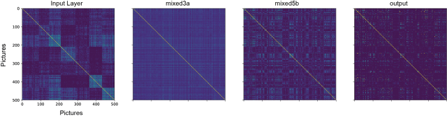
The structure obtained by clustering the inputs’ correlation matrix is clearly not maintained in higher layers. Most likely, the input layer similarity reflects features like overall color of the images, and it makes sense that this information is not so crucial for later classification.
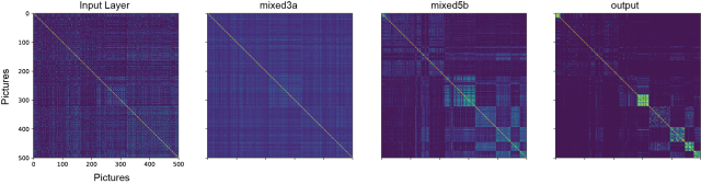
When clustering the same correlation matrices with respect to the outputs’ correlation matrix, the inputs seem to be more or less uncorrelated, but there is some structure also in the intermediate layers:
Now, to quantify how different images evoke different or similar activation patterns in different layers, I simply computed the correlation between each pair of the above correlation matrices. In the resulting matrix, entries are high if the two corresponding layers exhibit a similar correlational structure. With correlational structure, I mean that e.g. input A and B evoke highly correlated activations, whereas input C and D evoke anti-correlated activations, etc.
Here is the result for the main layers of the network (the layers are described in more detail in the GoogleNet paper). This is the most interesting part of this blog post:

Let’s have a close look. First, layers that are closer in the hierarchy are more similar and therefore show higher values in the matrix. Second, the similarity structure of the input space gets lost very quickly. However, decorrelation in the later convolutional layers (from mixed4b to mixed5a) slows down somehow, and is stronger again in the transition between mixed5a and mixed5b.
Most prominent, however, is the sharp decrease of correlation when going from the second-to-last layer (avgpool0) to the output layer. To my naive mind, this sharp decrease means that the weights connecting the last two layers contribute a disproportionately large effect to the final classification. One possible explanation for this effect is the strong reduction of the number of “neurons” from the second-to-last to the output layer. Another explanation is that learning in the earlier layers is simply not very efficient, i.e., not very helpful for the final task of classification.
In both cases, my intuition tells me that it would be much better to decorrelate the representations smoothly and with constant increments over layers, intead of having a sharp decorrelation step in the final layer; and maybe an analysis like the one above would be helpful for designing networks that compress available information in an optimized way.
A sidenote: The layers above are only the main layers of the GoogleNet. However, as described in the original paper in Fig. 2b, many of those layers consist of a couple of inception modules, basically 1×1, 3×3, 5×5 and MaxPool units that are concatenated lateron. Here’s the same analysis as above, but only for input, output and the two inception modules mixed4c and mixed4d (black borders).

Interestingly, the 5×5 convolutional units (dashed grey borders) are standing out as being not very similar to adjacent 1×1, 3×3 or MaxPool units, and also less similar to the final classification (output) than the smaller units of the same inception module. From this, it seems likely to me that the 5×5 units of the inception modules are of little importance, and it could be worth trying to set up the network as it is, but without the 5×5 convolutional units in the inception modules. However, it does not follow strictly from my analysis that the 5×5 units are useless – maybe they carry some information for the output that no other inception subunit can carry, and although this is not enough to make their representation similar to the ouput, it could still be some useful additional piece of information.
Another sidenote: While writing this blog post, I realized how difficult it is to write of “correlation matrices of correlation matrices”. Sometimes I replaced “correlations” with “similarities” to make it more intuitive, but still I have the feeling that a hierarchy of several correlations is somehow difficult to grasp with natural thoughts. (For mathematics, that’s easy.)
Yet another sidenote: It would be interesting to see how the decorrelation matrix shown above changes over learning. There is some work that uses decorrelation similar to what I’ve used here as a part of the loss function to prevent overfitting (Cogswell et al., 2016). But their analysis mostly focuses on the classification accuracies, instead of what would be more interesting, the activation patterns and the resulting decorrelation in the network. What a pity!
Along similar lines, I think it might be a mistake to check only the change of the loss function during learning and the test set performance afterwards, while disregarding some obvious statistics: correlations between activations in response to different inputs across layers (that’s what I did here), but also sparseness of activation patters or distributions of weights. And how all of this changes over learning. For example, the original GoogleNet paper (link) motivates its choice of network by aiming at a sparsely activated network, but it only reports the final performance, and not the sparseness of activation patterns.
So far, I have not seen a lot of effort going into this direction (maybe because I do not know the best keywords to search for?). A recent paper (that I only encountered after doing the analysis shown above) seems to partially fill this gap, by Raghu et al., NIPS (2017). It is mainly designed to perform a more challenging task, comparing the similarity of activation patterns across different networks. Basically, it reduces the neuronal activation patterns to lower-dimensional ones and compares them afterwards in this reduced subspace. But it can also be used to compare the similarity of activation patterns for one single layer, across time during learning and/or across input space.
I think that this sort of analysis, if applied routinely by neuronal network designers, it will contribute a lot to make neuronal networks more transparent, and I hope to see much more research going into this direction!
